An example for how to create custom theme color pallets in Bootstrap 5 using Sass. This post focuses on Bootstrap's color mapping functionality.
I was super happy to learn Bootstrap 5 is jQuery-less. Don't get me wrong, jQuery deserves it's place in legendary JS history, but doesn't play well with a lot of the latest frameworks today.
That said, it took me awhile to figure out how the Sass color mapping worked, so I shall share my experimentation in this post, using a new Vue app as an example!
The Setup
First off, I'm creating a new Vue 3 app with Vite to compile our Sass. Feel free to skip this section if you're not interested in setting things up and just want to see the Sass customization.
Make sure you're up to date with node, npm, etc. and run the following.
npm init vue@latestIf you run into any issues, you can find the official instructions for starting a Vue 3 app provided here.
The installer asks a series of questions, that you can answer mostly no too as we're just using this as an easy setup to compile the sass.
Name the project whatever you like (mine is bootstrap-5-sass-example). Next, move into it when created and install.
cd bootstrap-5-sass-example
npm install
npm run dev
Hooray, we should now have a Vue starter app running! Navigate to http://localhost:3000/ to see it. Mine looks like this:
Now let's install bootstrap! Exit the running terminal ctrl+c and let's keep going:
npm install --save bootstrap
npm install --save @popperjs/core
Next, let's setup our Vite to compile Sass!
We start by making a scss file in our source directory. I'm making the following new file & path: src>assets>sass>main.scss, and leaving the main.scss file blank for now.
Vue is currently using Vite to compile everything, so we can reference the path to our sass file in the Vite config file (vite.config.ts) by adding the following in the export default defineConfig block:
  css: {
    preprocessorOptions: {
      sass: {
        additionalData: `
          @import "@/assets/sass/main.scss";
        `
      }
    }
  }
Also, per the Vite docs, we need to install the Sass pre-processor by running the following (more info provided here):
npm add -D sassNow we're almost Bootstrap ready!
Let's test this out by adding some nice buttons. I'm going to grab some code from the Bootstrap website. We can add it into the main App.vue file in the source code (src>App.vue). I'm basically going to re-write the html template block inside this file with the following Bootstrap'd out code:
<template>
  <div class="container mt-5">
    <h1>Bootstrap Buttons!</h1>
    <div class="row">
      <div class="col">
        <button type="button" class="btn btn-primary">Primary</button>
        <button type="button" class="btn btn-secondary">Secondary</button>
        <button type="button" class="btn btn-success">Success</button>
        <button type="button" class="btn btn-danger">Danger</button>
        <button type="button" class="btn btn-warning">Warning</button>
        <button type="button" class="btn btn-info">Info</button>
      </div>
    </div>
  </div>
</template>
We also need to import our sass file. Again, in the App.vue file we replace the style block to import our sass:
<style lang="scss">
  @import "@/assets/sass/main.scss";
</style>
Creating the custom Sass file
Note, this is where things first got confusing for me. Bootstrap gives you either an option to load all of bootstrap (with no access to customization functions), or load parts of bootstrap (see here). For the life of me, I could not get Option B (including only parts of Bootstrap) to work. Since, I wanted all of bootstrap, as well as access to functions I decided to do both! e.g. I wanted to have my cake and eat it too! 🎂
So here's my main.scss file (hacked together with both options):
// Custom.scss

// 1. Include functions first (so you can manipulate colors, SVGs, calc, etc)
@import "../node_modules/bootstrap/scss/functions";

// 2. Include any default variable overrides here


// 3. Include remainder of required Bootstrap stylesheets (including any separate color mode stylesheets)
@import "../node_modules/bootstrap/scss/variables";
@import "../node_modules/bootstrap/scss/variables-dark";

// 4. Include any default map overrides here


// 5. Import all the rest of Bootstrap
@import "../node_modules/bootstrap/scss/bootstrap";


// Then add additional custom code here
Now lets run run the developer script in the terminal, to see things up and running:
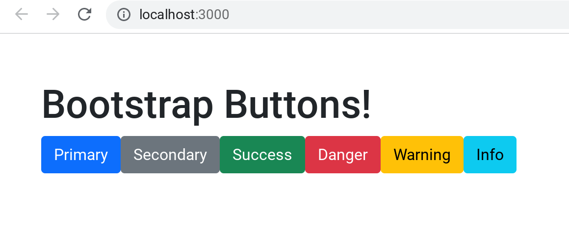
npm run devIt should look like this (with all the nice bootstrap colors)!
Now lets customize the Sass!
Bootstrap gives us some nice functions to do this. It's important to note where things are placed in the sass file for it to work properly, so pay attention to the comments in the main.cscc file.
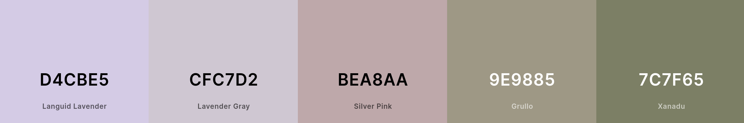
I'm going to head over to coolors to make a random new theme color palette. Here it is!
Now let's re-write bootstrap's usual color variables (primary, secondary, etc) in the main.scss file, just under the 2. comment:
// 2. Include any default variable overrides here
$primary: #D4CBE5;
$secondary:#CFC7D2;
$success: #BEA8AA;
$warning: #9E9885;
$danger: #7C7F65;
Notice these re-writes are added before loading Bootstrap's variables in the 3. comments. That's because Boostrap uses the !default tag on all of it's variables. That meas the theme will take Bootstrap's defined value by default, if no other value has been assigned prior.
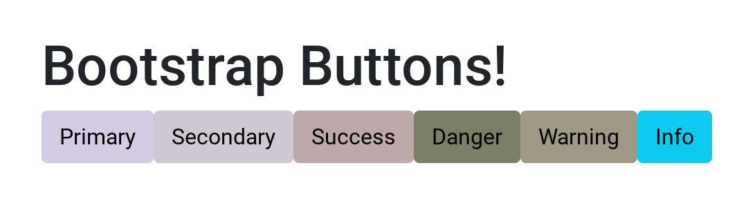
And our buttons now look like this:
Adding our own classes
Awesome! What if we want our own custom names for colors (e.g. btn-lavender), and with all the nice functionality, like changing shades when hovering over a button? Bootstrap has a mapping function for that! So, using coolors again, here's a new palette:
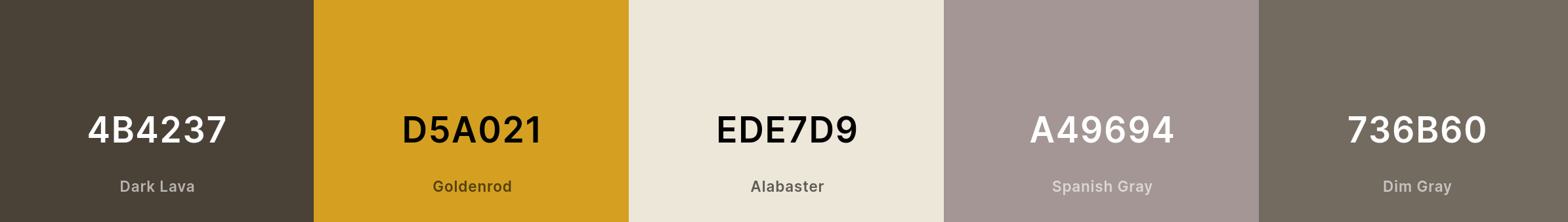
Per the bootstrap docs, we can load the Bootstrap variables first then call the map-merge function to add our own new custom classes to our pallet!
First we define the custom colors after the 4. comment (under the variables and mixins):
// 4. Include any default map overrides here
// Create your own map
$custom-colors: (
  "dark-lava": #4B4237,
  "goldenrod": #D5A021,
  "alabaster": #EDE7D9,
  "spanish-gray": #A49694,
  "dim-gray": #736B60,
);

// Merge the maps
$theme-colors: map-merge($theme-colors, $custom-colors);
Notice the map-merge function at the end. That's what creates our new color classes.
Now let's test them in our html (App.vue) file by adding the following:
<h1>Custom Buttons!</h1>
<div class="row">
  <div class="col">
    <button type="button" class="btn btn-dark-lava">Dark Lava</button>
    <button type="button" class="btn btn-goldenrod">Goldenrod</button>
    <button type="button" class="btn btn-alabaster">Alabaster</button>
    <button type="button" class="btn btn-spanish-gray">Spanish Gray</button>
    <button type="button" class="btn btn-dim-gray">Dim Gray</button>
  </div>
</div>
And now we check out the site:
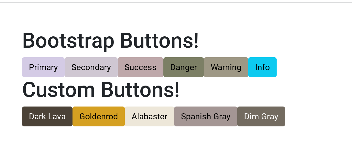
We now have a set of fully functional customized theme classes!
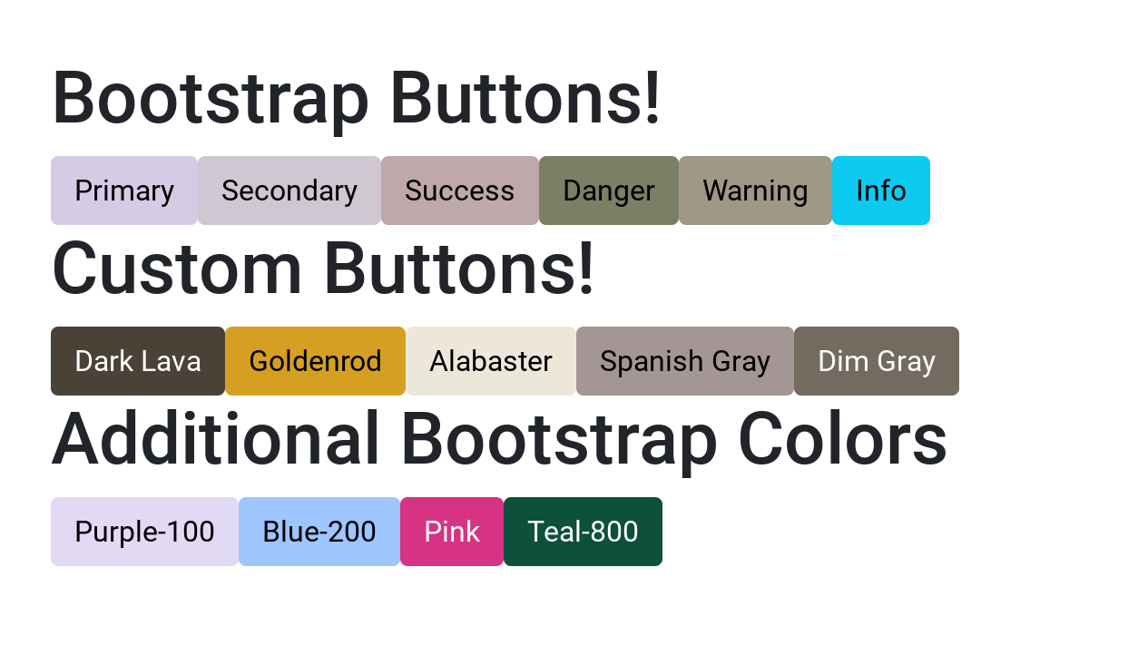
Accessing all of Bootstrap's colors
If you noticed, bootstrap has a ton of extra color classes! However, they are not added by default so we can also activate them in our color mapping function.
In this example, I'll add the following: purple-100, blue-200, pink, and teal-800.
We add a bit more html code to our App.vue file:
<h1>Additional Bootstrap Colors</h1>
<div class="row">
  <div class="col">
    <button type="button" class="btn btn-purple-100">Purple-100</button>
    <button type="button" class="btn btn-blue-200">Blue-200</button>
    <button type="button" class="btn btn-pink">Pink</button>
    <button type="button" class="btn btn-teal-800">Teal-800</button>
  </div>
 </div>
Also, we append to our main.scss file in the $custom-colors:
// 4. Include any default map overrides here
// Create your own map
$custom-colors: (
  "dark-lava": #4B4237,
  "goldenrod": #D5A021,
  "alabaster": #EDE7D9,
  "spanish-gray": #A49694,
  "dim-gray": #736B60,
  "purple-100": $purple-100,
  "blue-200": $blue-200,
  "pink": $pink,
  "teal-800": $teal-800,
);

// Merge the maps
$theme-colors: map-merge($theme-colors, $custom-colors);
Notice, since we use this function after loading the bootstrap variables, we can just add the extra color variables to our custom colors.
And the final site looks like this:
Final thoughts
Hope this helps you get started setting up Sass on Bootstrap 5!
Get the source code here: https://github.com/initialapps/bootstrap-5-sass-example
